

DonorTrail Landing Page
Web design, Prototyping
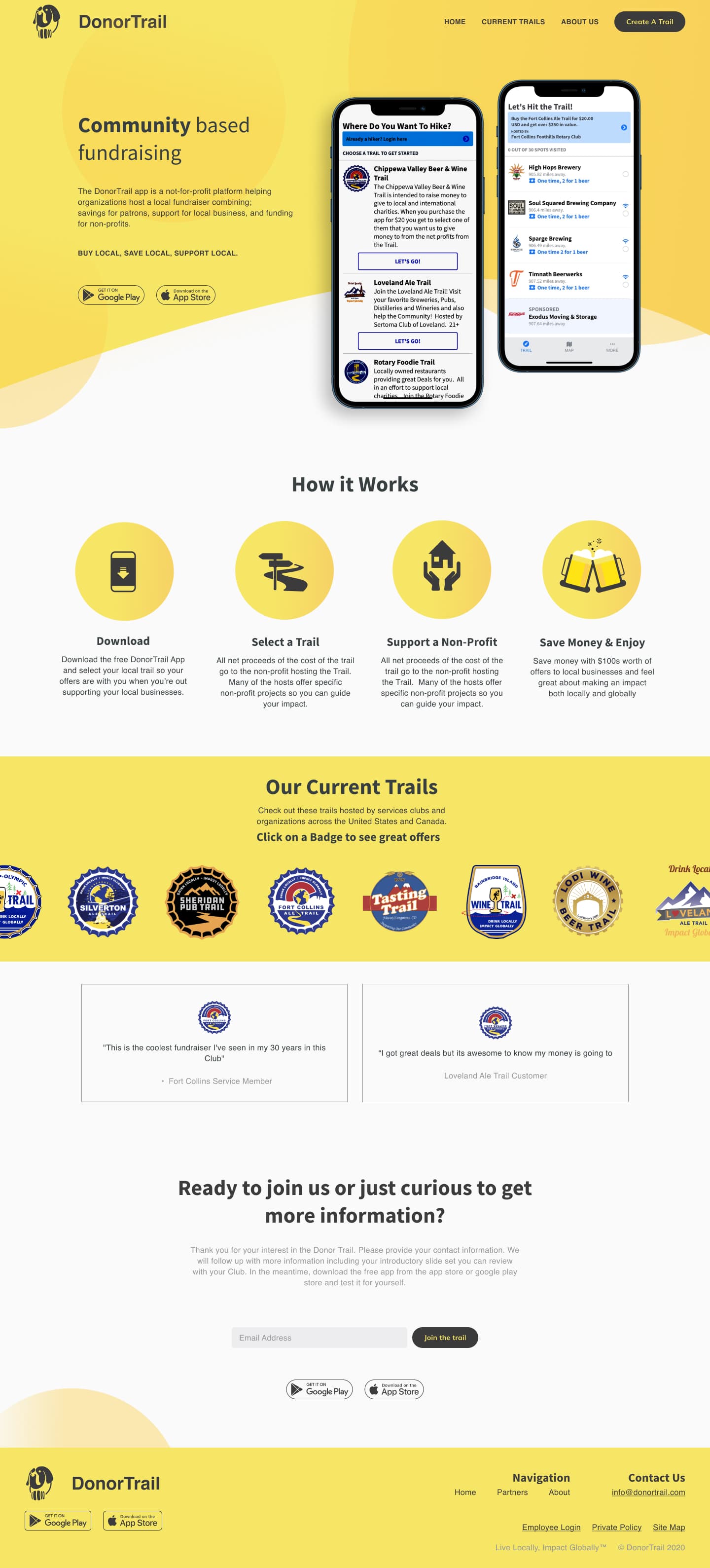
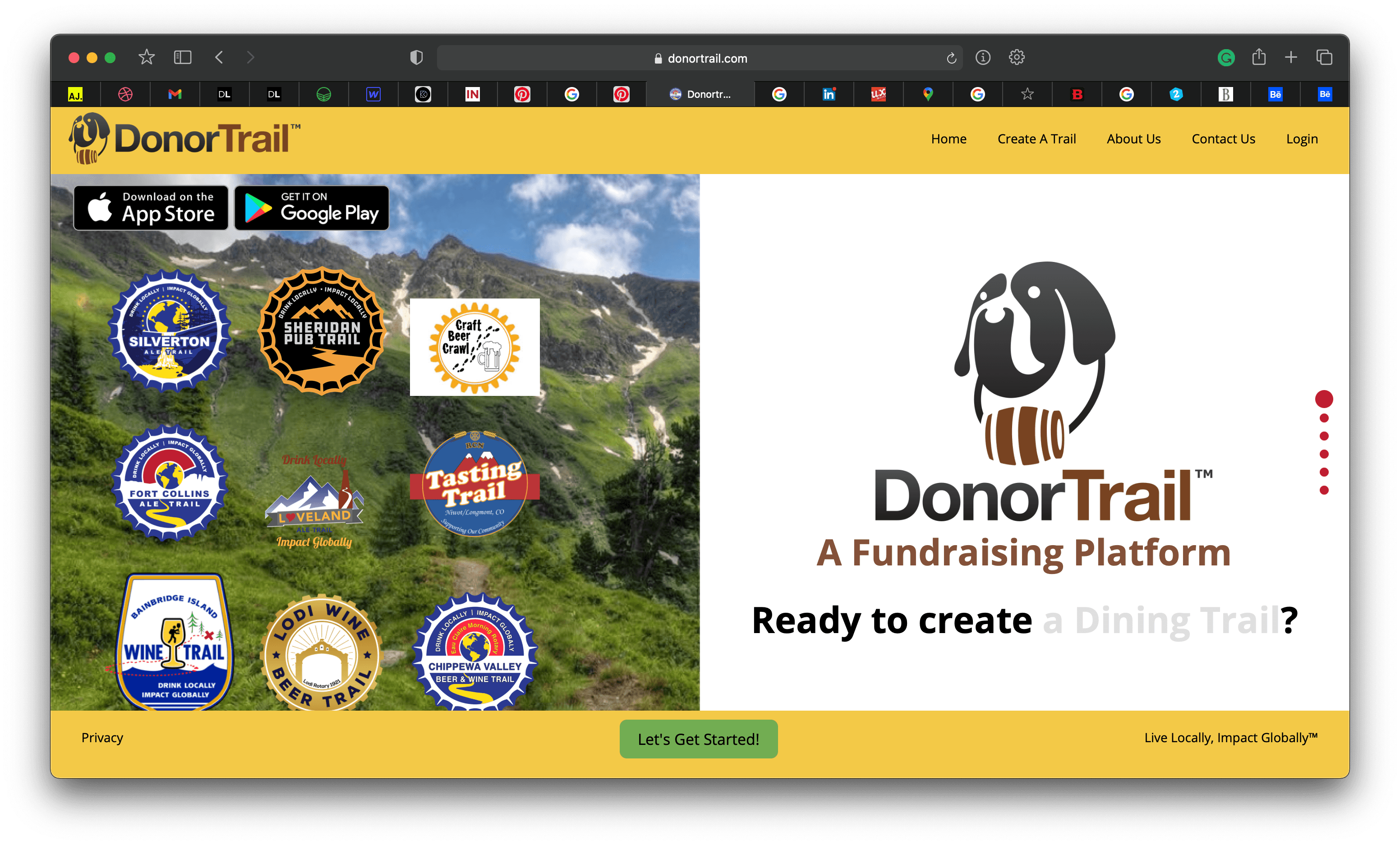
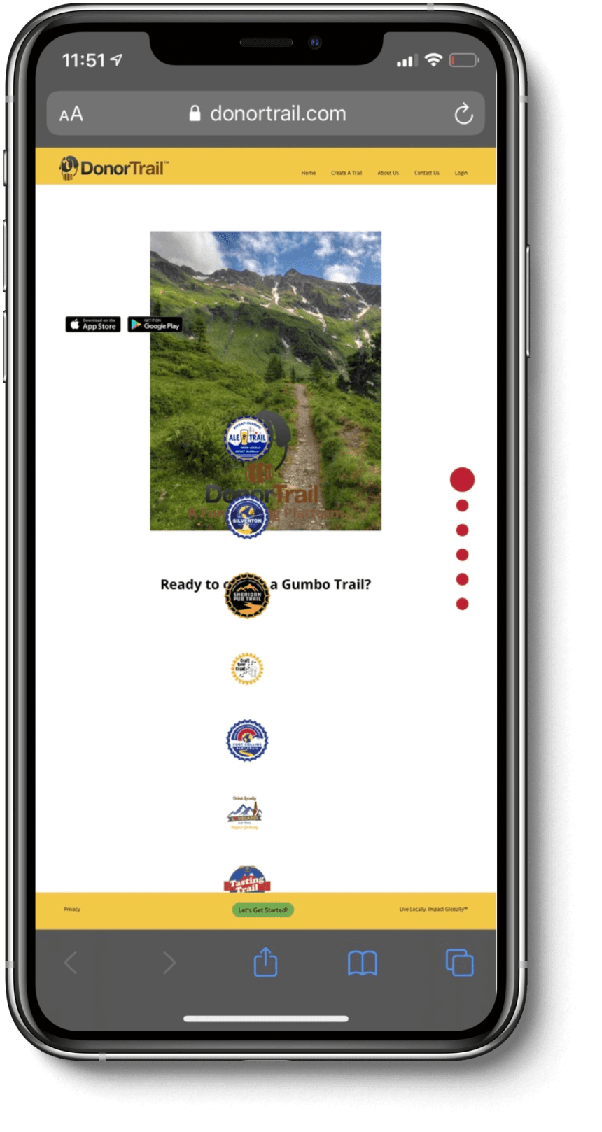
The landing page didn't explain what DonorTrail did, and it broke on the phones stakeholders were pitching from.
Problem
DonorTrail is a non-profit fundraising app platform. After the first launch, conversion had dropped, and the landing page was a big part of why.
The site struggled to communicate what the product actually did. Visitors arrived with no clear sense of the value and left before they understood it.
The problem had a second wrinkle. Stakeholders were regularly using the site during mobile sales presentations, and the responsive design was broken. The site they were showing to potential partners wasn't working as designed.
How I knew
The brief came directly from the stakeholders. They flagged both problems from experience, because they were living the mobile presentation issue firsthand.
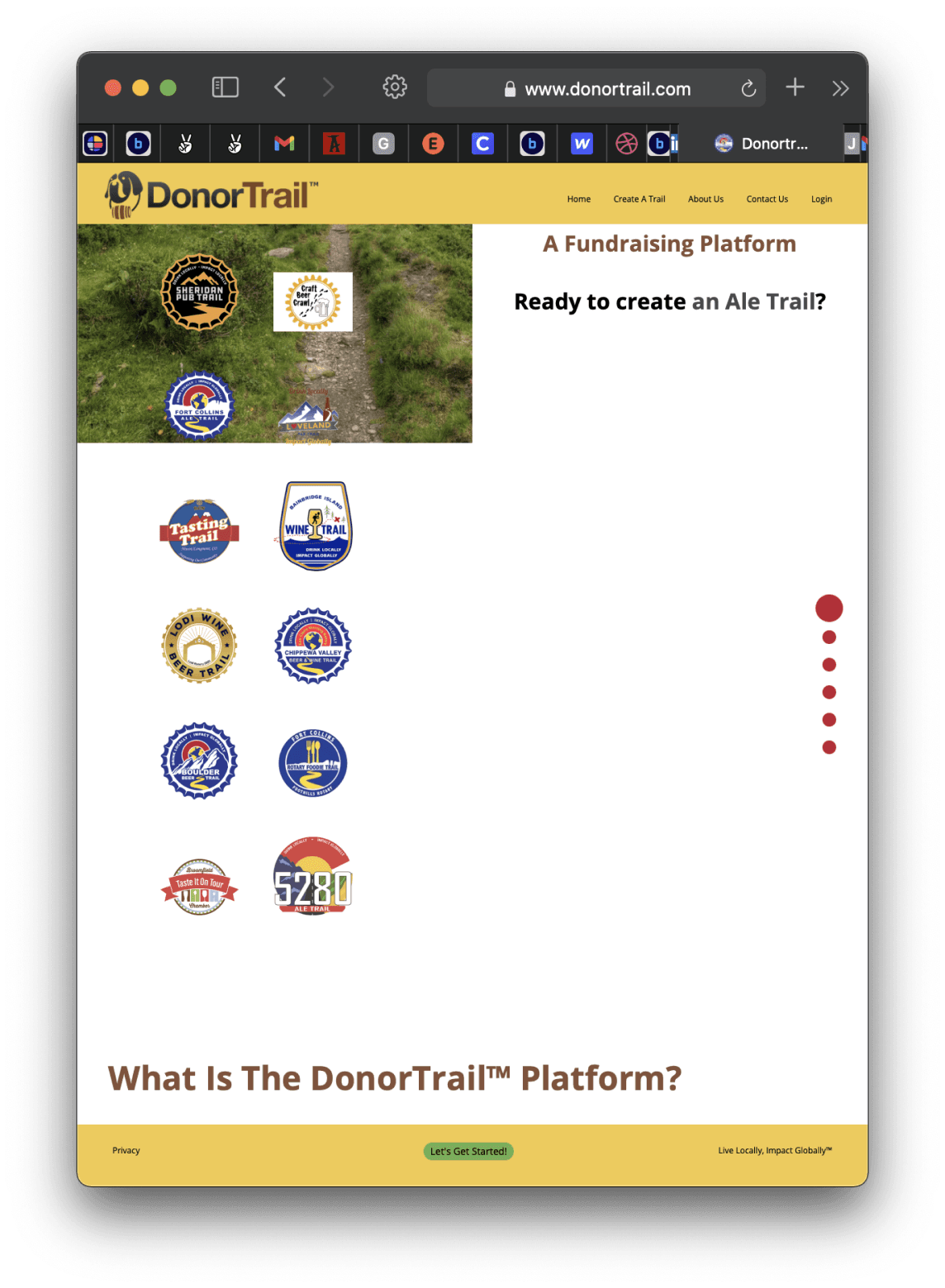
An audit of the existing site confirmed the structural issue: there was no hero moment for the product, the information hierarchy front-loaded secondary content, and the lead capture form had enough fields to give users pause before they even read the page.
The conversion goal was clear. Get more people to submit the "create a trail" form, or reach out through contact. Neither action was easy to take.
What we did
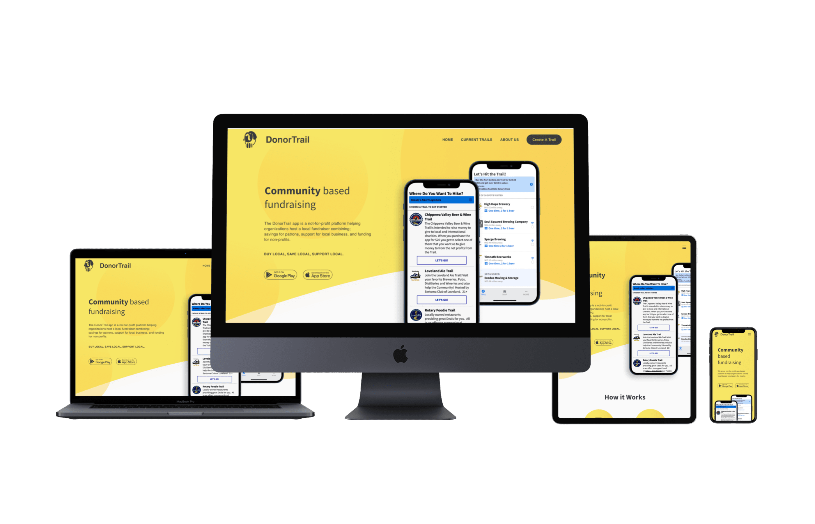
The redesign focused on three things: clarity, form simplification, and mobile.
The most significant call was pulling the product front and center. The landing needed to show DonorTrail before it explained it. Secondary information that was cluttering the page got cut or moved.
I delivered two wireframe iterations before moving to high-fidelity, so we could lock in the information hierarchy with the client before touching visual details.
The form came down to a single email field. A multi-field form as a first touch point asks for too much commitment too early. Email gets people in the door. Everything else comes later.
I rebuilt the responsive design from the ground up, prioritizing the mobile breakpoint that stakeholders were already presenting from.
Outcome
The redesign was delivered in two weeks. No post-launch metrics were shared, since this was a short freelance engagement with limited follow-through on analytics.
The mobile presentation problem was solved by the time the project wrapped.
This was early work, and the takeaway was about scope discipline. A landing page has one job, and the previous design was trying to do five. Cutting to the essential ask — show the product and get the email — is the whole brief.